All demos
Demo project
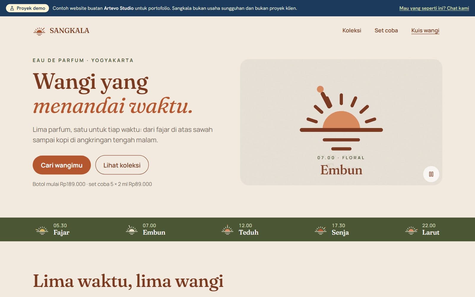
Made by Artevo Studio as an example of our work, not a real client project. The brand, prices, and reviews in it are invented.
Sangkala logo
Logo and visual identity for a local perfume brand
- Client
- Demo Artevo Studio
- Year
- 2026
- Type
- Logo design
- Status
- Concept demo, not a client
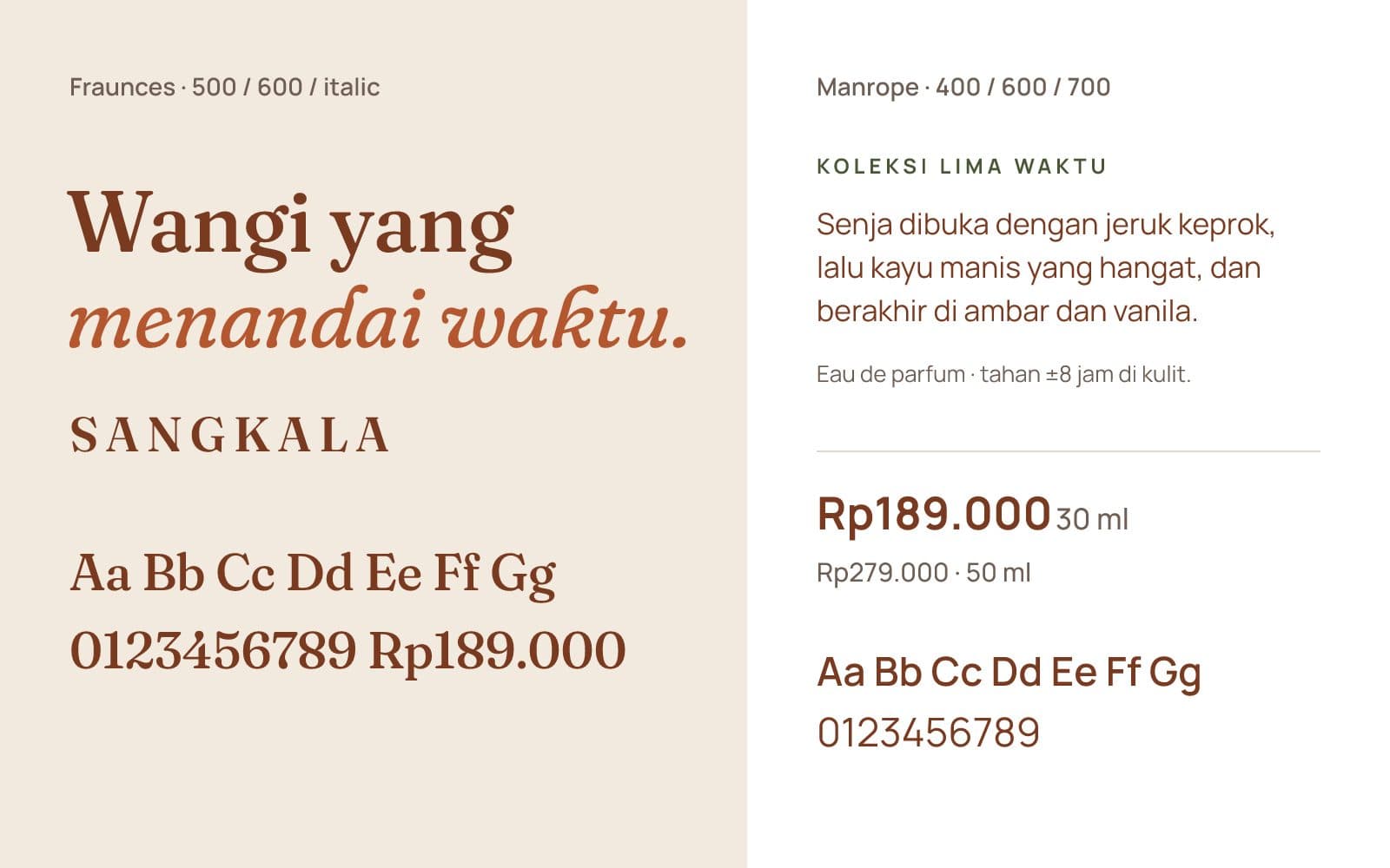
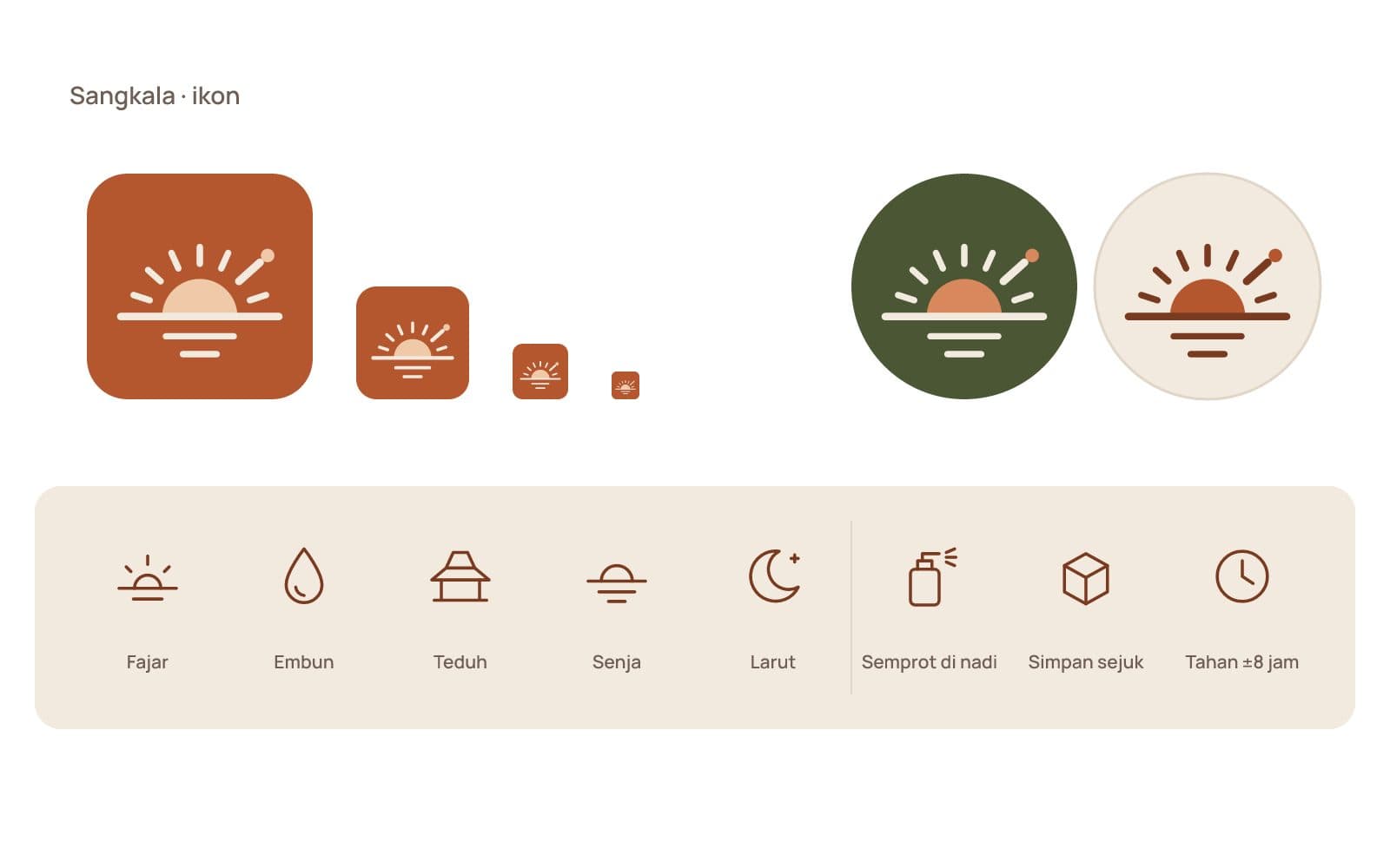
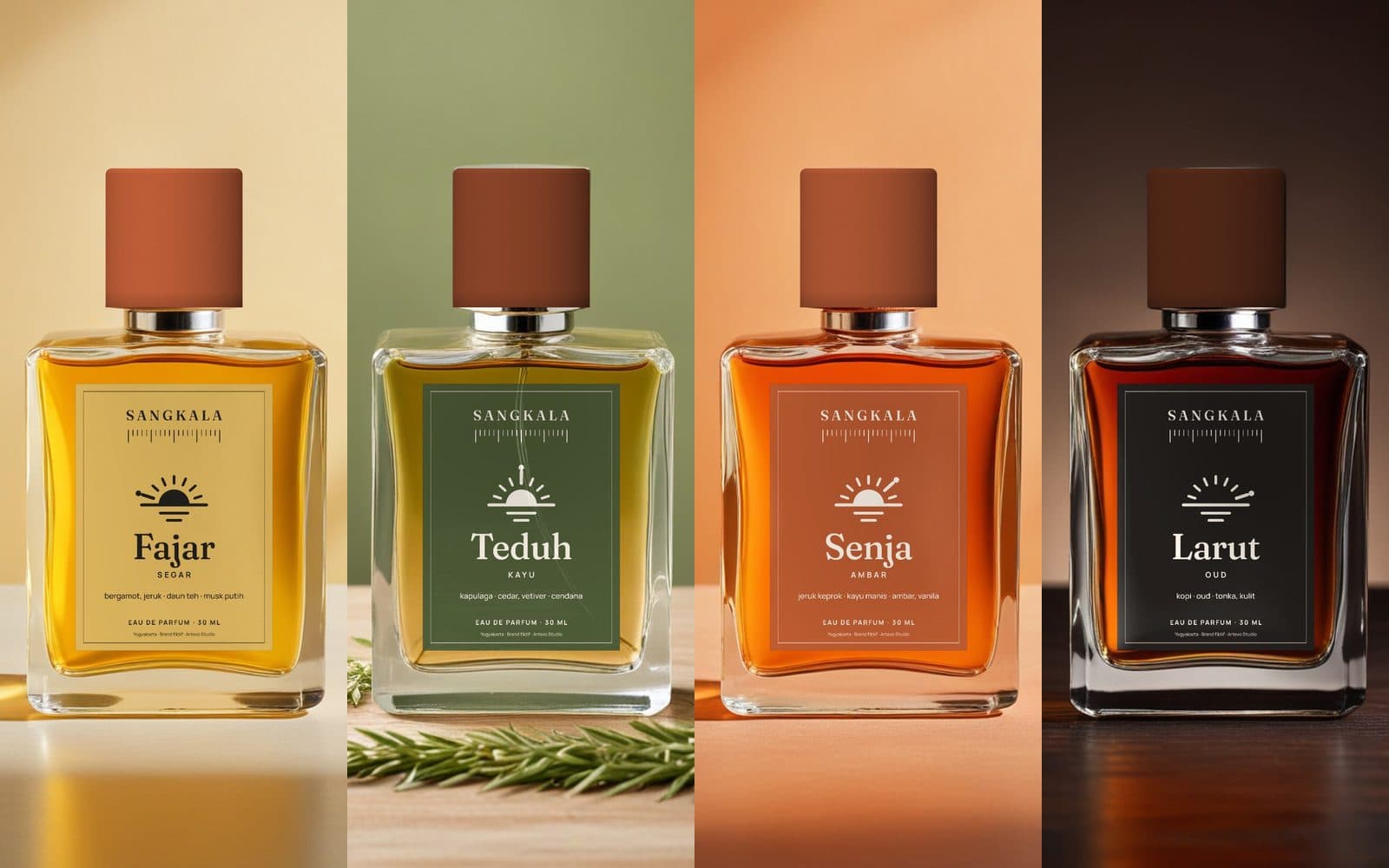
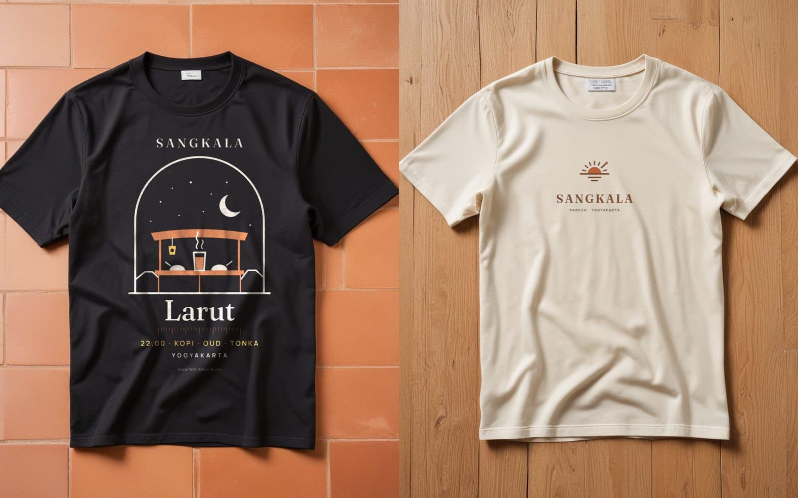
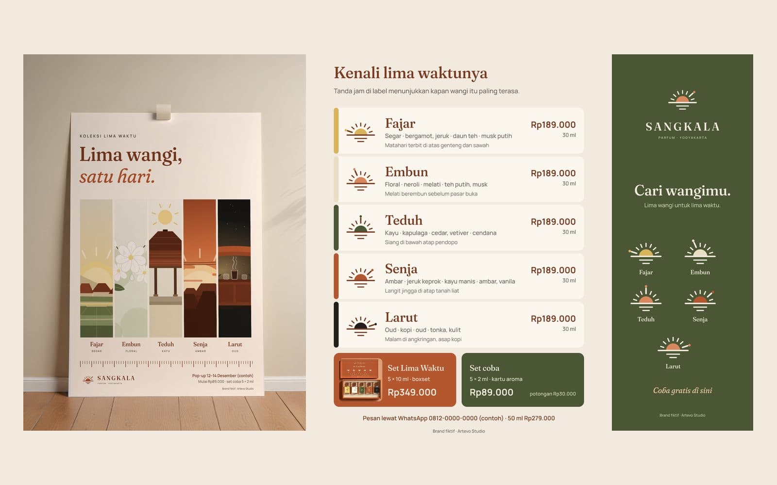
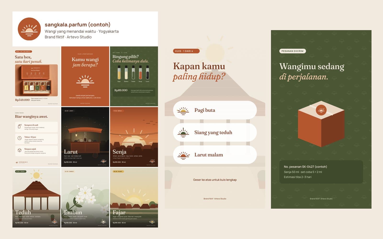
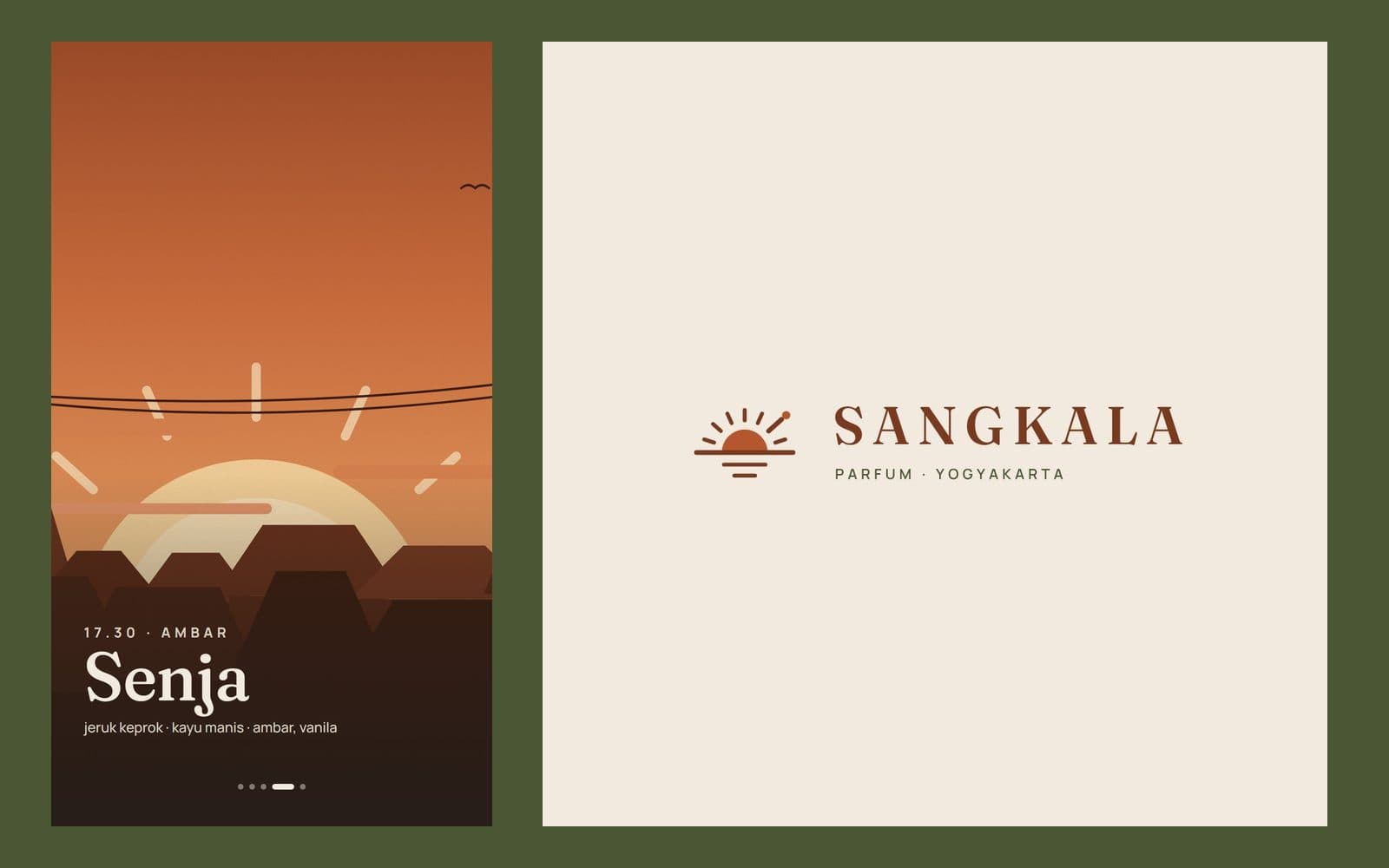
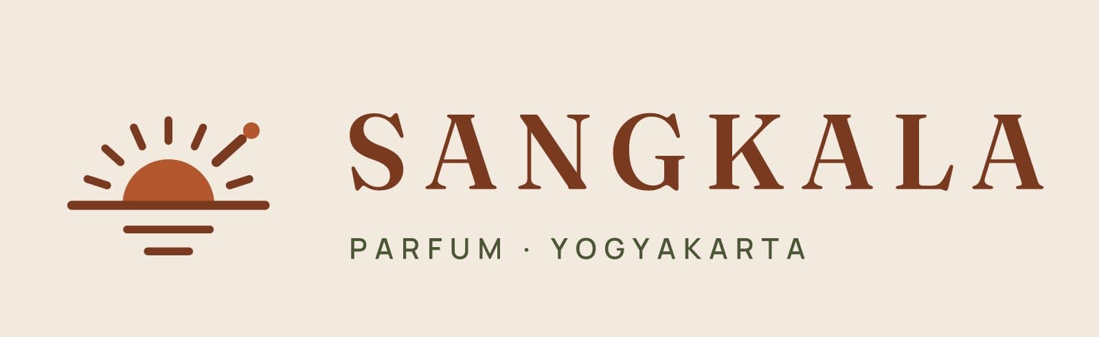
The identity of Sangkala, an invented perfume house in Yogyakarta. The name is the Javanese word for a marker of time, and the collection has five scents for five times of day. The mark is a sundial: a sun half-risen on the horizon with the hours around it, one of them longer and ending in a dot, the moment this bottle keeps. On each scent's label that long mark moves to its own hour, so one logo becomes the system for the whole range. Terracotta and moss on lime-plaster cream; Fraunces and Manrope.
What we built
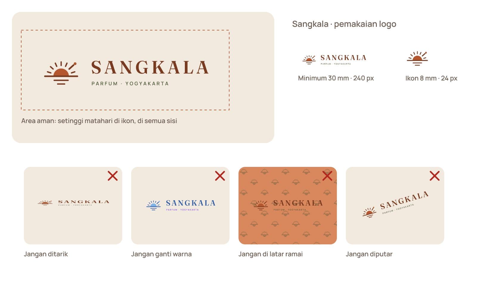
- Stacked and horizontal logo on cream, terracotta and moss
- A label system: the dial's long mark points to each scent's hour
- Colour sheet with contrast ratios, five label colours, type specimens
- Clear space, minimum sizes, and four ways not to use the logo
- Five time-of-day icons and three how-to-wear icons
Built with
SVG, Python
The finished pieces

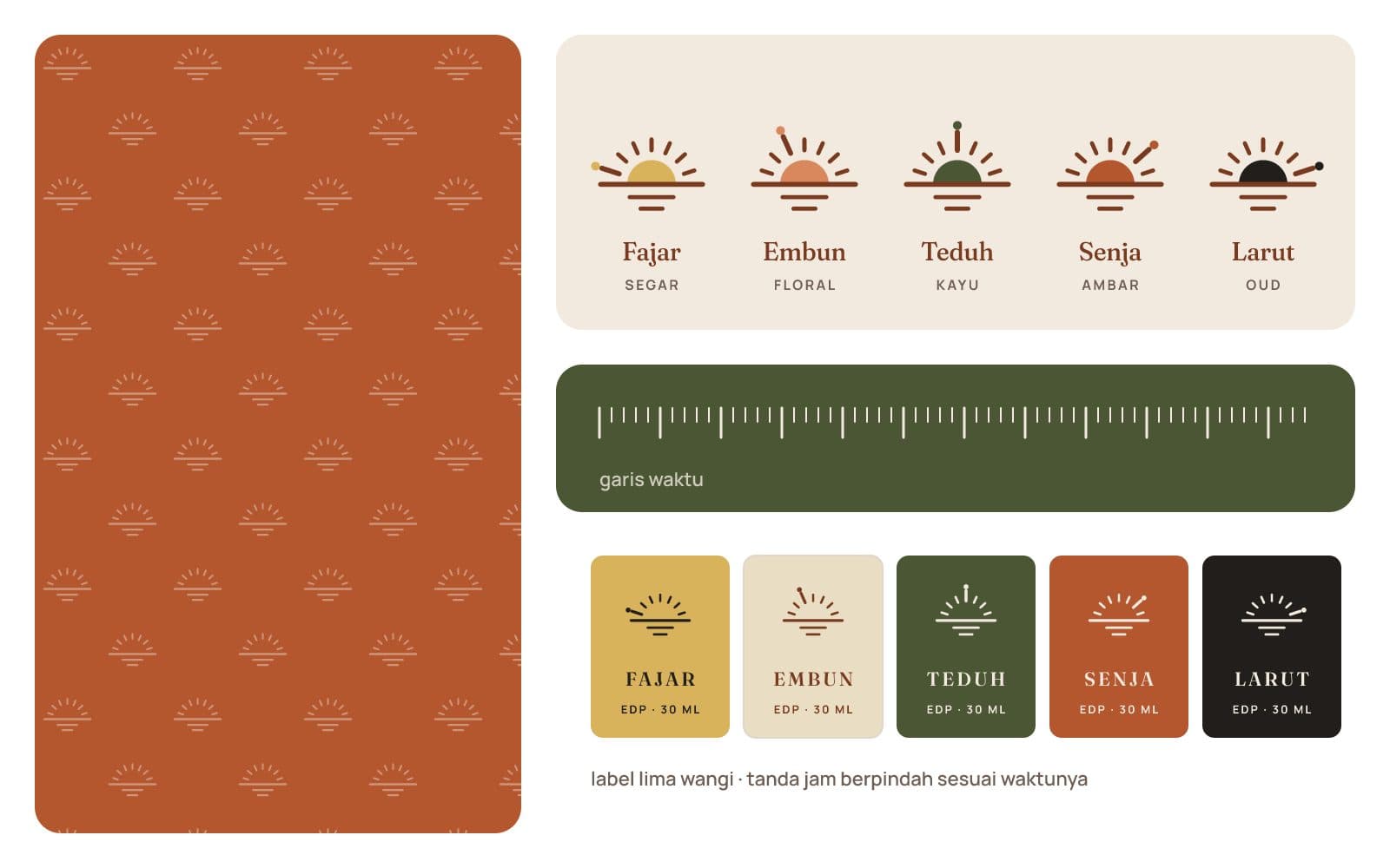
The long mark walks from dawn to night. 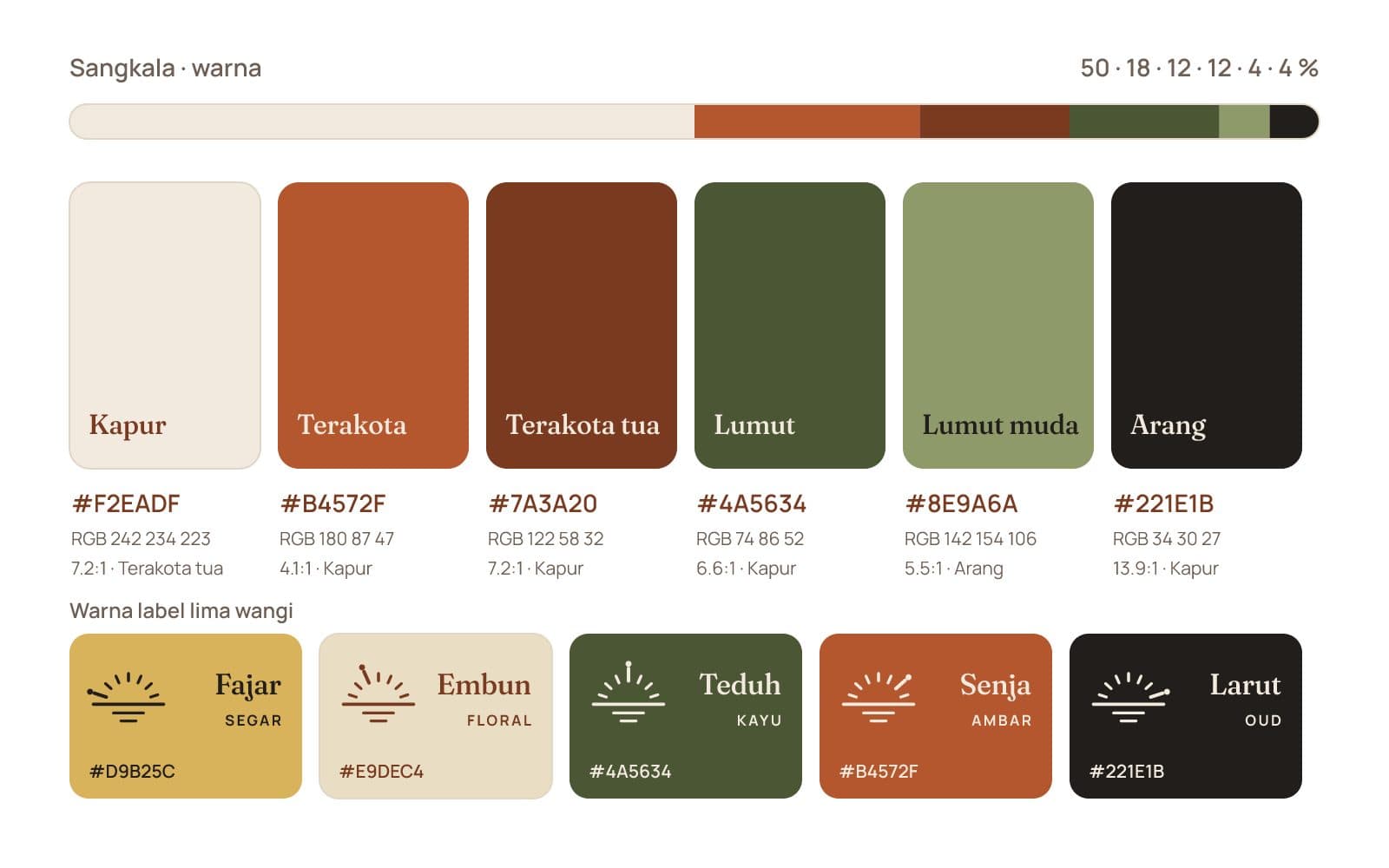
Cream leads; terracotta for large type, deep terracotta for text.